EXPERIMENT 230393
Tormenta Rítmica
Logo design for a modern shaman with astral chart and tarot reading and massage therapy services.

Conceptualisation
The initial approach to this project was very complex as there were many different prompts (provided by the client) to explore. To keep it simple and coherent only few of them were paired at once. We also decided to focus on the fortune telling side of the business to narrow down the scope.
DRUMS
Represents rhythm. Almost always reduced to a circle.
ASTRAL SYMBOLS
Moons, stars, night sky, constellations, etc.
WAVE
Sometimes represented as a stroke.
STORM
Depicted with lightning bolts and clouds.
PHI
Subtly introduced to some designs or represented as an eye.
NATURE
Shamanic inspiration, animal designs or plant motifs.
Research
We studied direct competitors and other related companies logos and branding to understand what the market trend currently is. Compared to other sectors, there is an abundance of small astrology business that have a very amateur style, with low quality designs and incoherent branding.
Out of those that present a more professional stance, we can observe three trends: minimal (San Serif fonts, simple logos, clean, more subtle), ancient (old style or transitional typefaces, reminiscent of 90s graphics, images with excessively fine details), and (script types, rounded illustrative images, either very fresh or very outdated, with eastern symbols). In terms of colour, purples, navy blues and black are the main choice, with the occasional use of white or yellow as accent colours.

The age of people consulting astral reading experts ranges from early 20s to mid 50s. Our target audience focuses on the younger segment: Millennials and Gen Z (who have a growing interest in the topic and are more likely to rely on online services). Women are more frequent users compared to men. Customers look for spiritual connection, wisdom, hope, bonding with nature and reassurance shrouded in a veil of mysticism and magic. They are likely to engage in other activities such as meditation, pagan beliefs or alternative therapies. They actively engage in fashion trends such as Y2K and retro and vintage 70s graphic styles.


Regarding the product itself, it has a varied set of symbols to represent it. From celestial illustrations (stars, moons, constellations, etc), to ancient symbolism (horoscope, runes, palm reading, etc) and modern aesthetic trends (witchcore, fairycore, 90s revival, gothic, bohemian, etc), which are specially relevant for Gen Z.

Logo design
During the initial sketching stage we tested different options in Procreate playing with some of the concepts and prompts mentioned before.
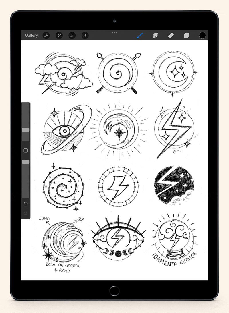
Some of these sketches were then further developed in Illustrator and tested in different colours, styles and layouts.
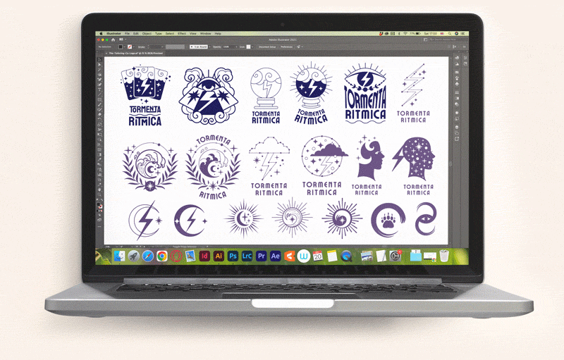
The selected design was refined and tested with different typefaces, elements distribution, and colours.
The final design consist of logomark and logotype with different adaptable configurations for distinct visual situations. The logomark represents the services (tarot with cards, astrology with stars, fortune telling with the eye) as well as the brand name (lightning bolt).
The logotype features a groovy typeface that compliments the illustration and ads a touch of retro (70s inspired, very popular with Gen Z).
Since the brand has a bolder presentation compared to competitors, the colours were kept more traditional (mainly purples that evoke mystery and are usually linked to womanhood, with turquoise and yellow as the accent tones), giving it a magical flair.
Technical details
Find below detailed information about the safe area, construction details, font and colour palette.
#310E68
RGB 49 14 104
CMYK 98 100 27 17
#8862D1
RGB 136 98 209
CMYK 64 66 0 0
#B2A3E2
RGB 178 163 226
CMYK 36 39 0 0
#EAE3FF
RGB 234 227 255
CMYK 9 13 0 0
#6DCCBA
RGB 109 204 186
CMYK 57 0 35 0
#FFD580
RGB 255 213 128
CMYK 0 19 58 0