EXPERIMENT 940027
The Tailoring Co. London
Logo design, product branding and packaging design for a new company's perfumery and body care line made in England.

Conceptualisation
The Tailoring Co. is a new brand based in London that develops luxury body and skin care products for modern gentlemen.
It was inspired by the style of the famous Savile Row: traditional English high-end tailoring. This type of aesthetic is remarkably sophisticated, relaying on the good quality of their fabrics and fine cuts for design, while everything else is kept clean and minimal.
Since the image of the brand strives to be perceived as classic, we also considered other important concepts such as timeless British typefaces and motifs, elegance and simplicity, clean lines and neutral or muted colours and found inspiration in other high-end brands such as Burberry or Barbour.
Our target audience are adult men with a high socioeconomic status and conventional life roles looking for high-quality products. We kept the approach quite conservative, emphasising traditional masculine design choices such as formality, predominantly straight shapes and dark colours.


Logo design
During the initial sketching stage we tested different options in Procreate playing with the concepts mentioned before.

Some of these sketches were then further developed in Illustrator and tested in different sizes and layouts.

The selected design was perfected and tested with different typefaces, ratios, colours, contrast and sizes, as well as adjusted spacing.
The final designs feature a simplified British flag in the official 5:3 ratio, a curvy line representing a thread (tailoring) and a crown (coats of arms), a traditional transitional typeface (Baskerville), and a colour palette consisting of two PANTONE tints + true black (CMYK 0,0,0,100) to improve readability in smaller sizes.
Alternative versions were also created to offer a wider range of possibilities for future applications in different media.
Branding
The Tailoring Co. has a wide range of premium-quality products that come in 4 different scents. Each fragrance has its own particular colour palette, pattern/fabric and specific elements (sewing buttons).
This grants an easy way to add more products to the collection, keeping a coherent image.


The packaging has 2 main styles: realistic and simplified. The application varies depending on the type of printing technique.
For products that require flat tints and wrap-arounds, the minimal version will apply. For other packaging elements, like labels and boxes, with more versatile printing options, the realistic version can be used.
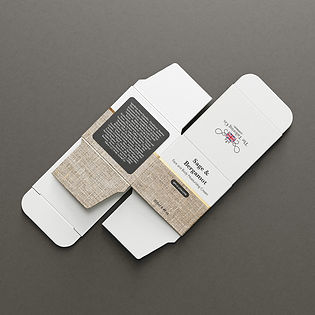
Packaging
These are the products featured in this project: bath & shower gel (scented), deodorant (scented), eye cream (unscented), face & body moisturiser (scented), hand cream (scented), hand wash (scented), perfume (scented), shaving cream (scented), soap (scented).


Products have a luxurious matte finish and those printed with the realistic version also display refined gold accents.


Items within a collection have slight variations in layout and design to easily differentiate from one another, but still share the core design elements.


The eye cream is the only unscented product of this project and has a specific design that differs from the rest.
In this case, we took another element related to the tailoring world and very representative of our refined customers: the tie (also a subtle pun eye/tie).
The design wraps around the box, while the rest is kept white and minimal. Other elements such as typography and realistic textures tie this composition to the rest of the collection.

