EXPERIMENT 520316
SNOCA
branding
Logo design and branding for sports drinks brand focused on winter athletes and other adventure seekers.

Conceptualization
SNOCA is a new brand that manufactures sports drinks for winter sports athletes and adventure seekers.
Their mission is to help professional athletes, hikers and outdoors enthusiasts to stay hydrated, energised and healthy. SNOCA stands for:
STRONG ▶︎ Bold and confident, we are the brand astounding athletes and world explorers rely on and trust.
NIMBLE ▶︎ we are fast to adapt to customer needs and create new innovative ideas to solve any uprising issues.
ORGANIC ▶︎ our products are crafted using only natural ingredients from sustainable, ethically-sourced providers.
COMMUNITY ▶︎ we build and support sport groups and encourage feedback. We strive to grow and become better together.
ACTIVE ▶︎ we promote and sponsor winter sports and encourage outdoors adventure.

We translated these principles into artistic concepts that could potentially be applied during the design process.
STRONG ▶︎ Bold shapes, bright colours, high contrast, photo/type/vector combo, Sans Serif, Grotesque or Egyptian typefaces, strong lines, negative space.
NIMBLE ▶︎ Minimalism, clean lines, flexible shapes, curves, colour block, Sans Serif fonts.
ORGANIC ▶︎ Curves, circles, texture, earthy colours, nature images, fluid shapes, script fonts.
COMMUNITY ▶︎ friendly, round, circle.
ACTIVE ▶︎ Dynamic shapes, curves, movement, slanted, asymmetry, yellow and orange.
Research
We also took into consideration the main product of the company, translating it to fluid images evoking water and hydration, and launched a competitive audit with other energy and sports drinks brands to understand the market better.
Three main trends can be identified: organic (more rounded, static, softer, friendly, fluid), bold (bright neon colours and black, straight lines, powerful, geometric, modern) and pharmaceutical (neutral, minimal, clean, geometric, serious).

We researched our target audience: professional winter sports athletes, hikers, campers and other outdoors enthusiasts.
We studied their socioeconomic status (medium-high to high), brands they gravitate to (The North Face, Oakley, Atomic, Reusch...), gender (45% women, 55% men, according to Beijing 2022 Olympic games), age (18-40), etc. We focused on the setting of their activities, choosing images of alpine landscapes (mountains, forests, river), winter (sports, snow, cold weather, etc) and on the type of trends they participate in (modern, dynamic and iconic designs, bold colours...).


Logo design
During the initial sketching stage we tested different options in Procreate playing with the concepts mentioned before.

Some of these sketches were then further developed in Illustrator and tested in different colours, styles and layouts.
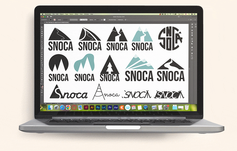
The selected design was refined and tested with different typefaces, styles, colours, contrast and sizes, as well as adjusted spacing.
The final designs consist of logomark and logotype. The logomark represents several concepts in one single pictogram: S (brand's name), curves (dynamic, organic, fluid, community) and landscape (versatile stroke that can be interpreted as a ski slope, a river and a mountain trail). The logotype features an italic Sans Serif that is clean and minimal, reminiscent of Scandinavian design, subtly asymmetric to break the staticity of the overall design and with a good balance between round and sharp edges.
The brand is positioned between the organic and bold trend, hence showing characteristics found in both.
Branding guidelines
The style guide defines 3 different versions of the logo and application instructions, as well as technical measurements for construction and safe space.

Size tests and information about minimum logo sizes and measurements are also specified.

The colour palette comprises 5 different hues accompanied by their HEX, RGB, CMYK and PANTONE values, together with indications about their application. The core tones gravitate towards blue and turquoise, with predominant light colours, creating a frosty yet upbeat effect. To break the monotony of the harmony and draw attention when needed, we introduced a vibrant dynamic colour associated with exercise and energy.

The accessibility section offers indications about colour usage to ensure enough contrast comply with the WCAG guidelines AA grade.

In terms of typography, both the logo and the website use the Montserrat family. Montserrat Alternates is exclusively reserved for the logo. Titles and subtitles share the italic characteristic with the logo to increase coherence and continue with the subtly dynamic theme. A more in-depth guide will be developed as part of the design system of digital applications.

Instructions and examples of logo accepted applications and rejected practices are also provided (DOs and DON'Ts).


Photography for banners, social and promotional material will reflect a sense of adventure, amplitude and space. It will display snowy landscapes of mountains, forests or professional winter sports premises. The images will have low contrast, muted colours and cool undertones. People can appear on the picture; if they do they will be the main focal point of the composition, ideally wearing clothes that make them stand out and matching the colours of the brand. These photos need to have a good contrast with the text that overlays them (white or navy blue) and should not contain too much detail or visual clutter.

As products have not yet been developed, we used AI tools to generate example images of product photography for future reference. A minimum of 3 images should be provided for each product (front, back and closeup). Products will appear against a light, pale, muted studio background with diffuse light coming from the left side. The front and back images should be perfectly aligned (no tilting). The closeup will vary depending on the important detail to show.

Iconography is fairly simple, appearing in the accent turquoise corporate colour (can also appear in navy for high contrast accessibility options) and featuring a more round style that other elements to draw more attention to them.

Application
Find some print and digital collateral and merchandising branding application examples below.

